Identity
Visual System
Iconography
Messaging
Brand Guidelines
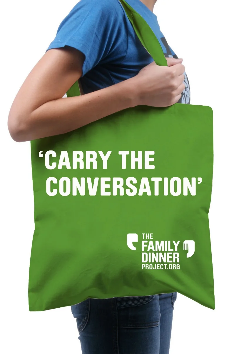
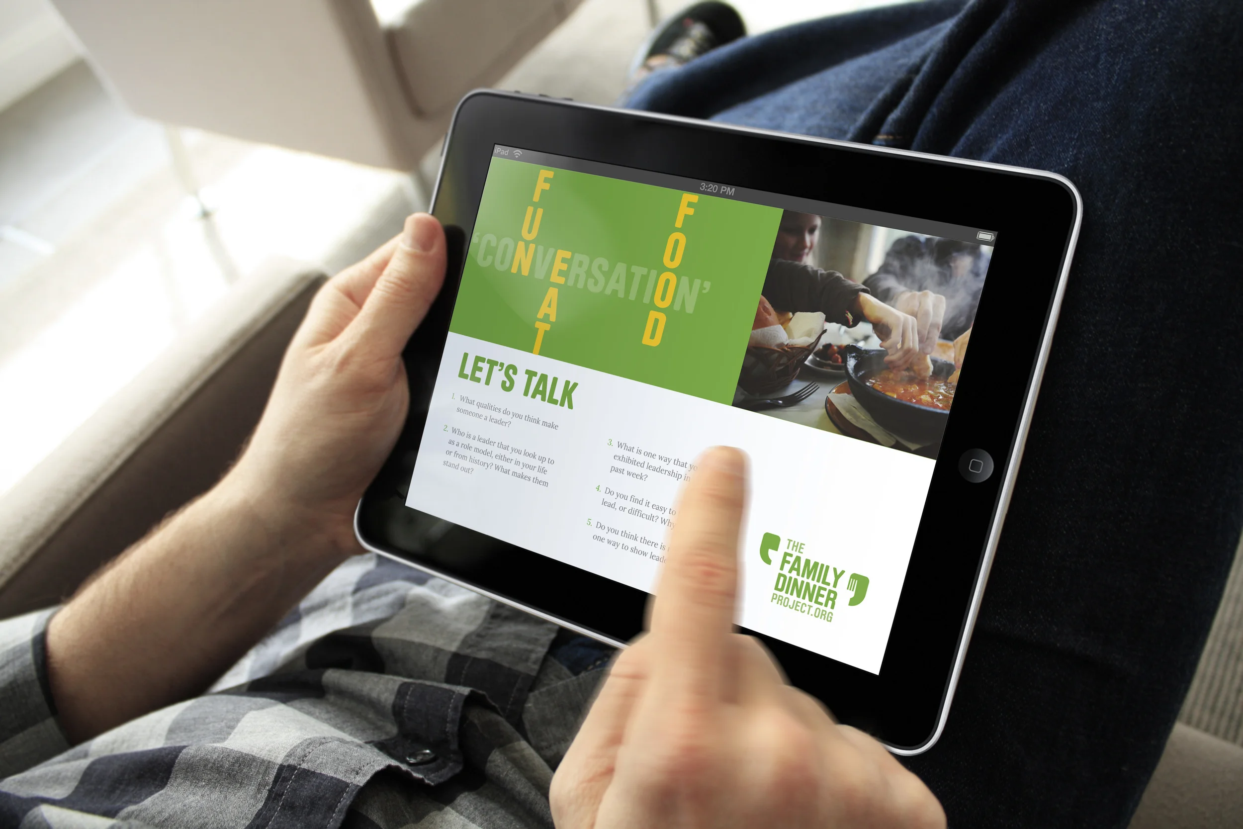
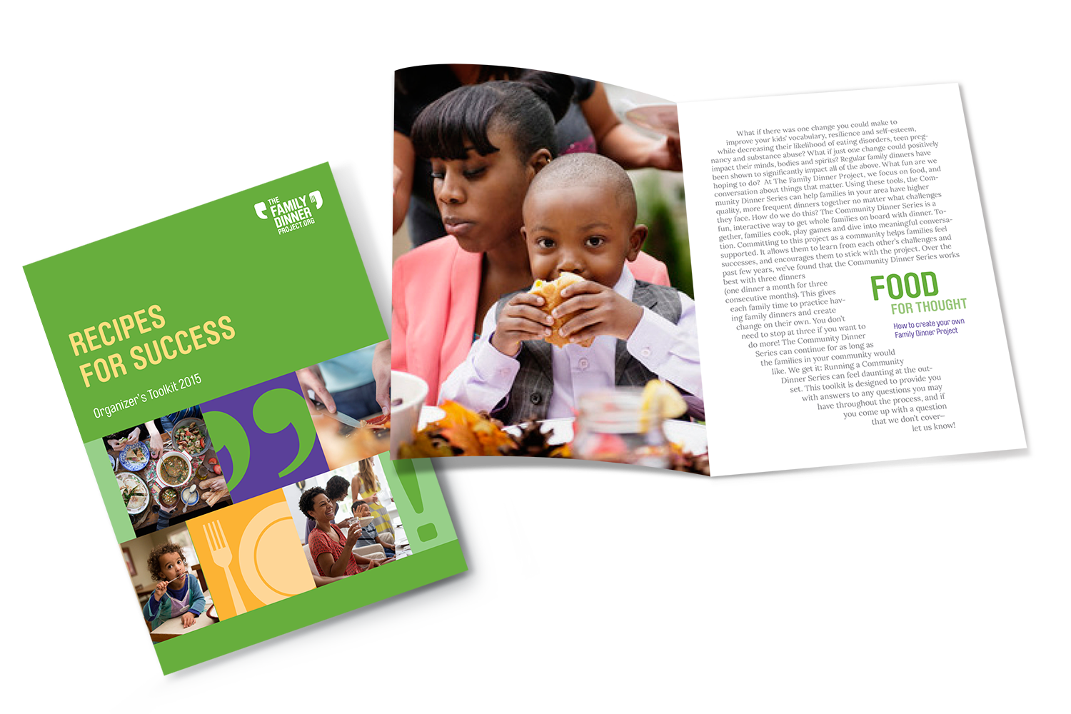
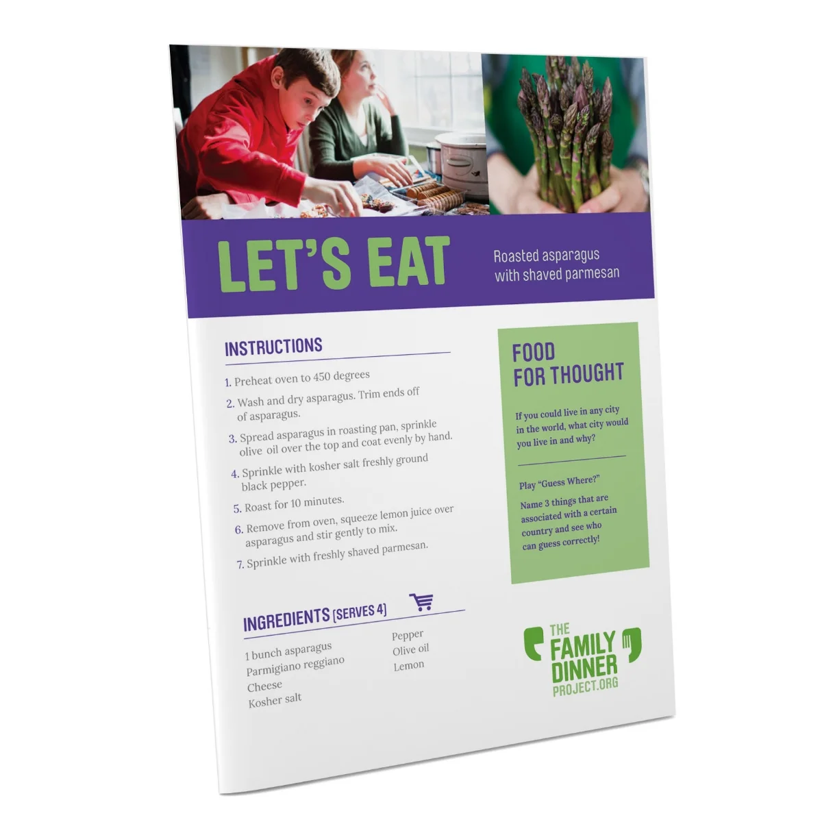
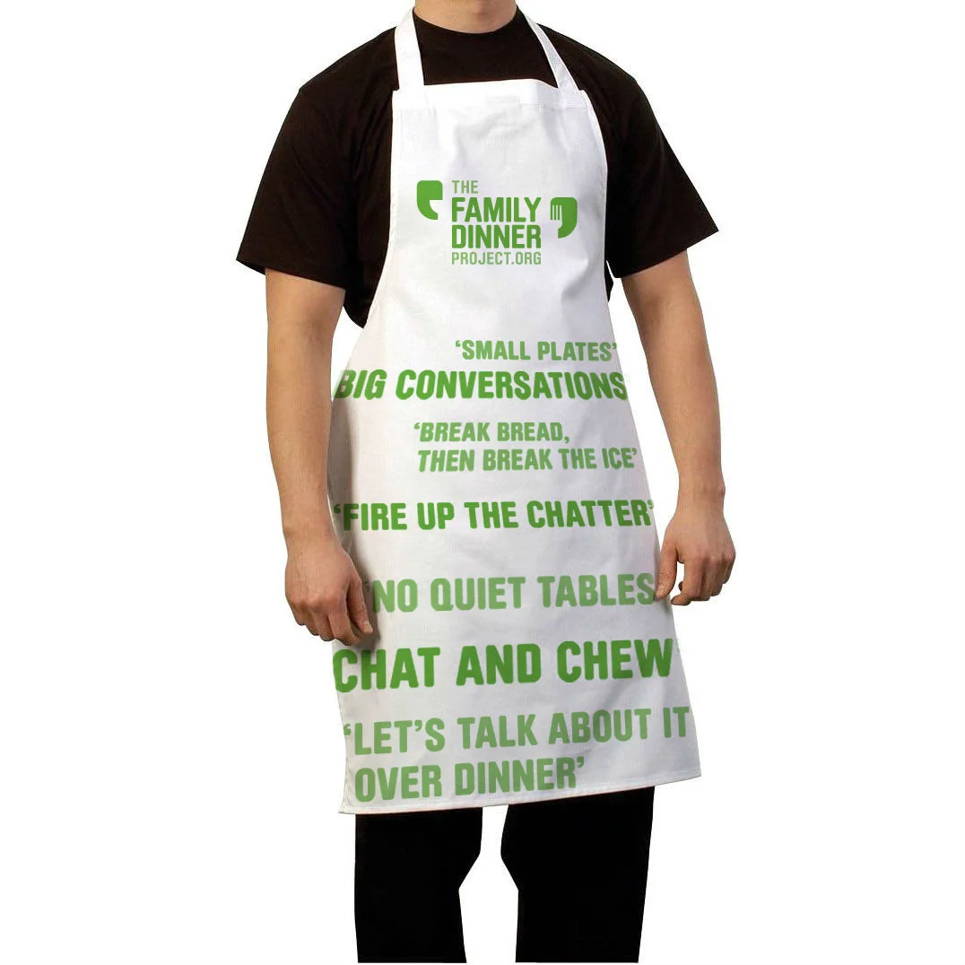
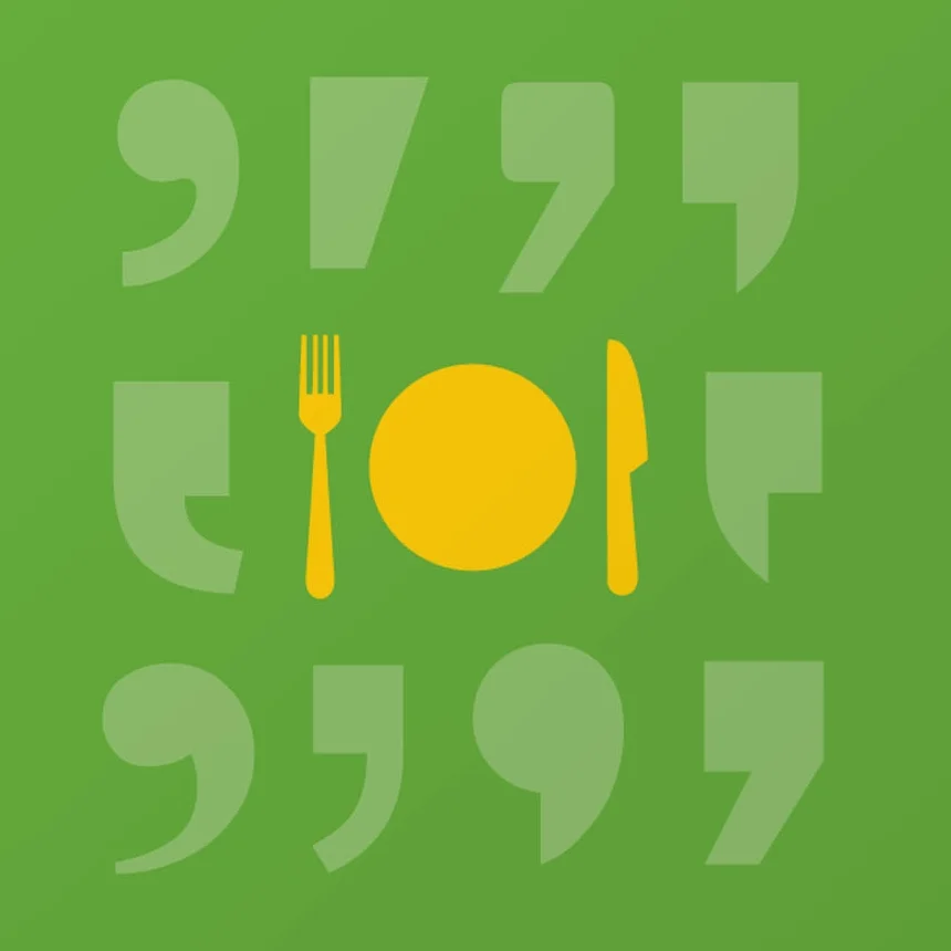
The Family Dinner Project is a
non-profit organization operating
from Harvard University that
brings families together to help
realize the benefits of family
dinners: the power to nourish
ethical thinking. The two quote
marks of the logo frame the
wordmark—reminiscent of a
dinner table—and communicate
the major brand tenets of food
and fun leading to meaningful
conversation. The left quote,
which resembles a smiling face
in conversation, conveys fun
and open dialogue. The right
quote with a fork embedded at
the crook of the mark, represents
food—the preparation, cooking,
eating, and sharing with family.
A succinct and uplifting style of
messaging was developed
that speaks to the brand—food,
fun, and conversation—in
ways that are engaging and
conversational. This tone
of voice became as compelling
as the visual design.
A project with:
Additive Agency, New York
Brand Identity Guidelines
Dealer Ad Guidelines
Visual System Applications
Dealer Brand Architecture
An extensive suite of brand
identity guidelines was written
and designed to augment the
execution and global launch of
the brand redesign for Cadillac.
Applications and exhibits were
designed and mocked up in
context, as the rules around the
new brand were created for
the primary brand guidelines,
Cadillac dealership advertising,
brand architecture, and
original photography.
A project with:
FutureBrand, New York
Identity
Tagline
Visual System
Website
Marketing Materials
Client Templates
Brand Guidelines
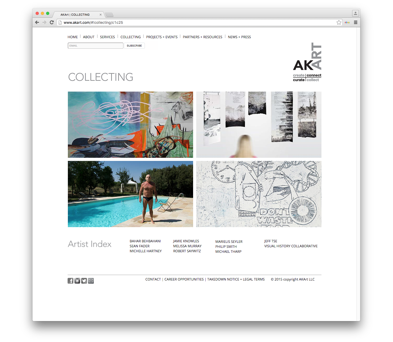
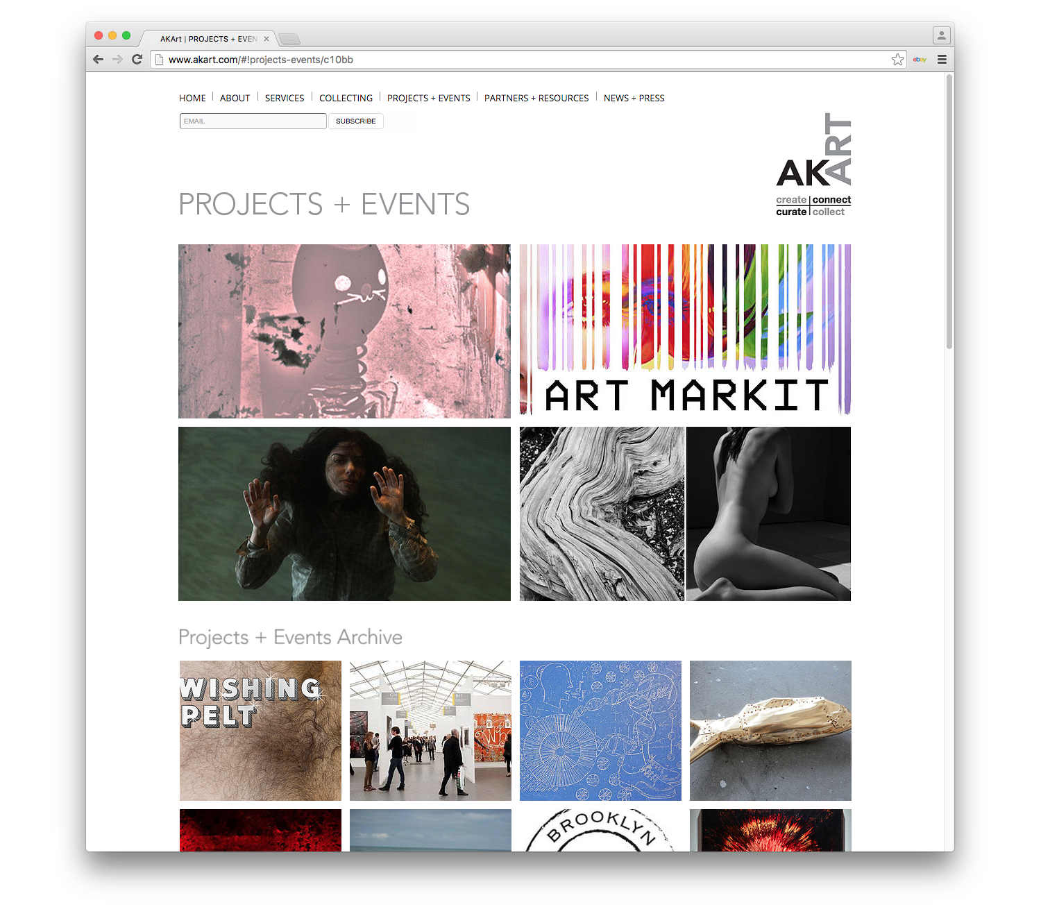
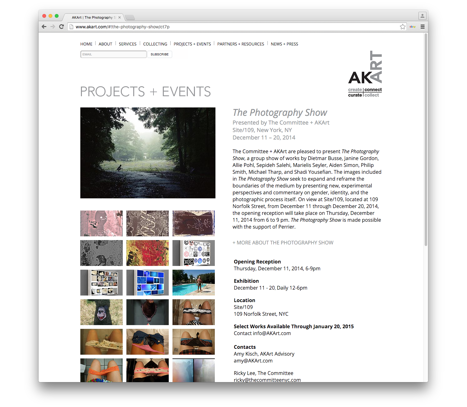
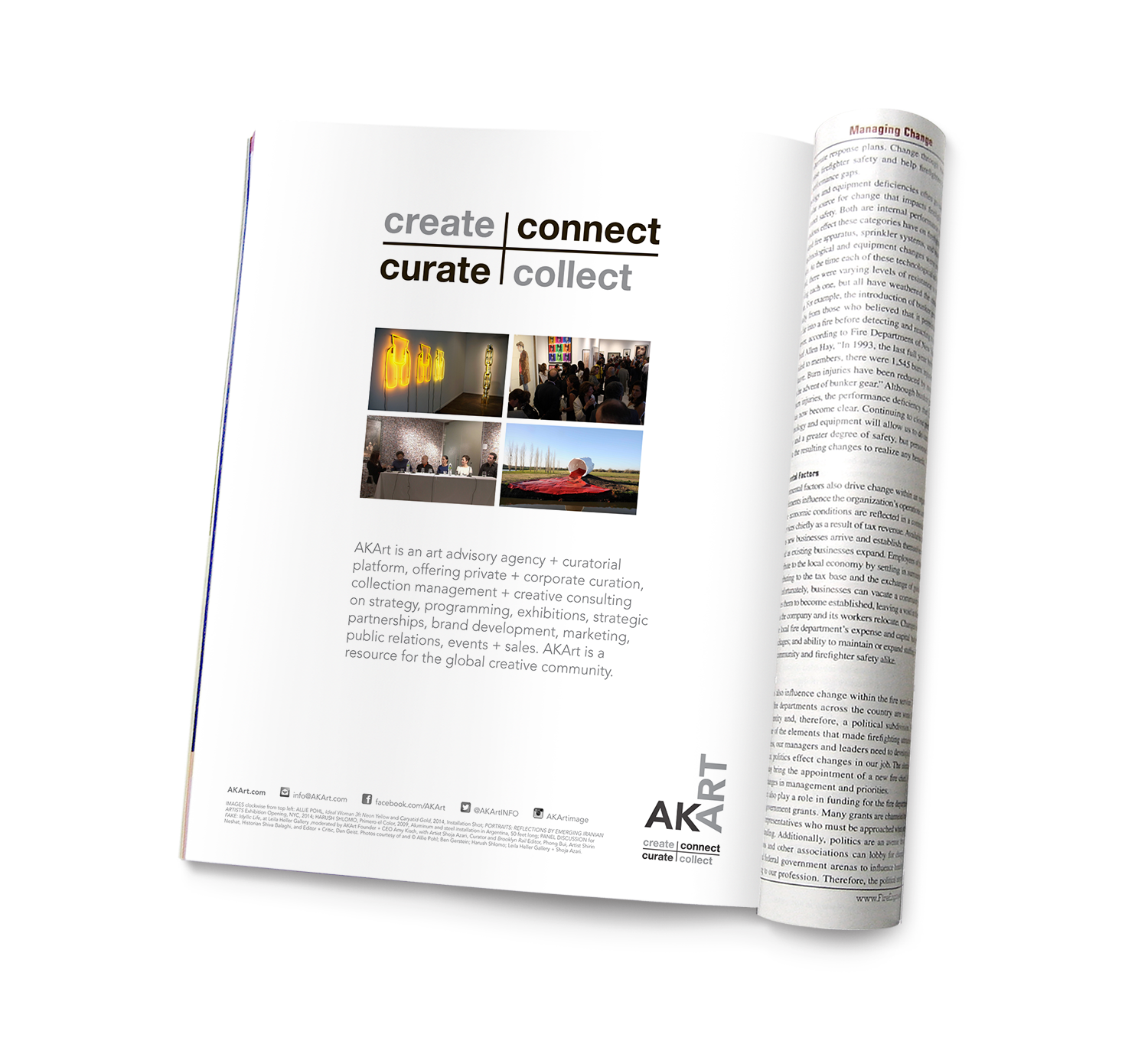
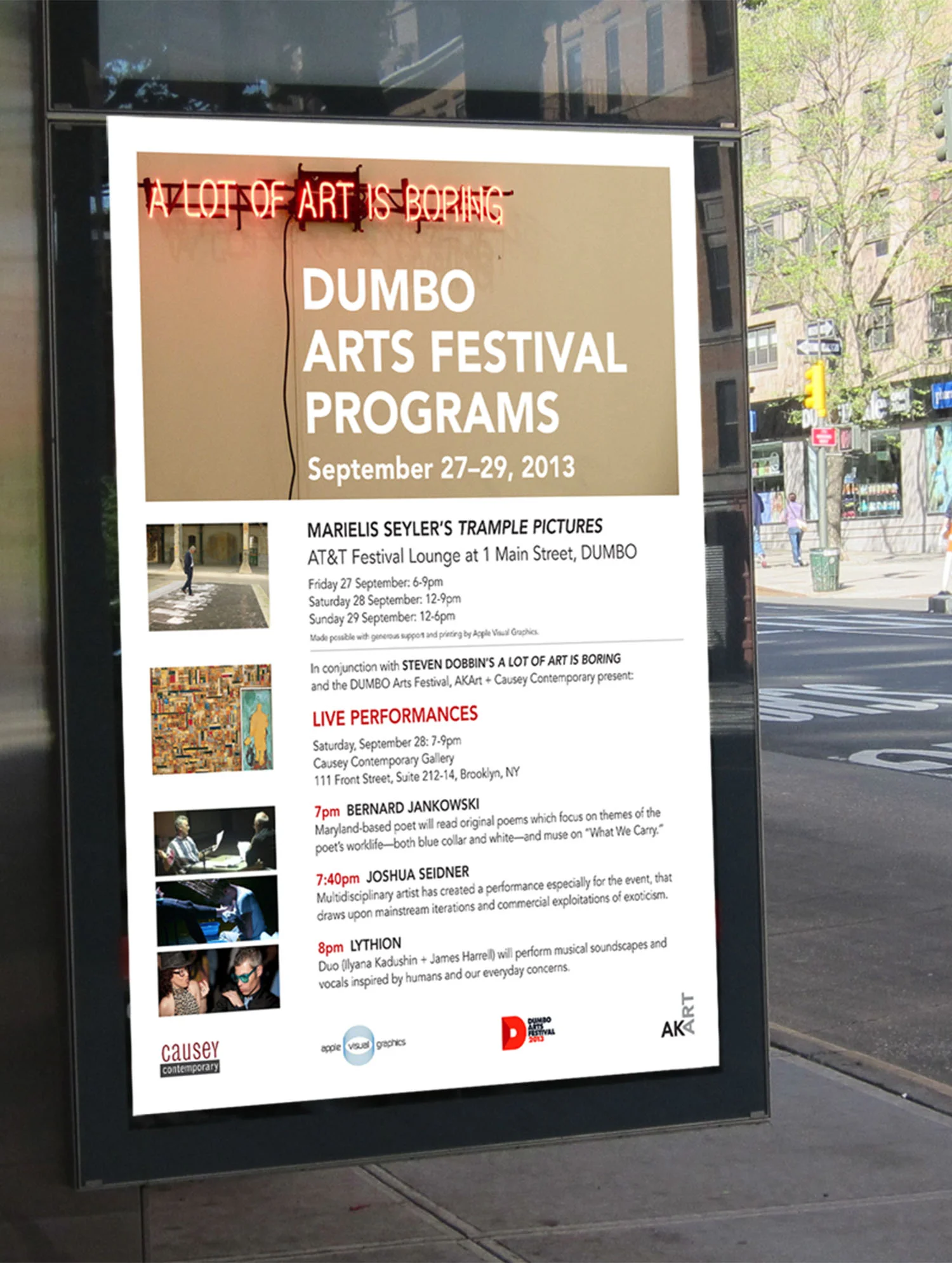
A subtle but sophisticated identity
was created to represent this
art advisory agency working with
a range of clients, including art
collectors, art galleries, art fairs,
museums, curators, auction
houses, and corporations.
The AKArt website is a key
touchpoint where potential clients
and collaborators can interact
and learn more about the brand
so the design was purposefully
crafted to match the sensibility
of the AKArt identity and visual
system. White space becomes
the blank canvas to support the
dynamic imagery of AKArt
client work and project events.
A rectangular grid system inspired
by the crosshatch structure of
the AKArt tagline was developed
to showcase imagery in a
compelling and functional way.
The logo represents the art
advisor/client relationship—
the ‘AK’ as the advisor, and
the client literally seeing ‘Art’ on
the wall. The letterforms not
only represent the initials of the
company owner, but also a
subtle nod to ‘AKA’ or ‘Also
Known As… Art.’
Branding Concepts
Identity
Visual System
Iconography
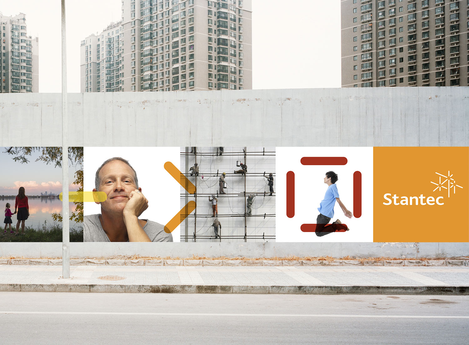
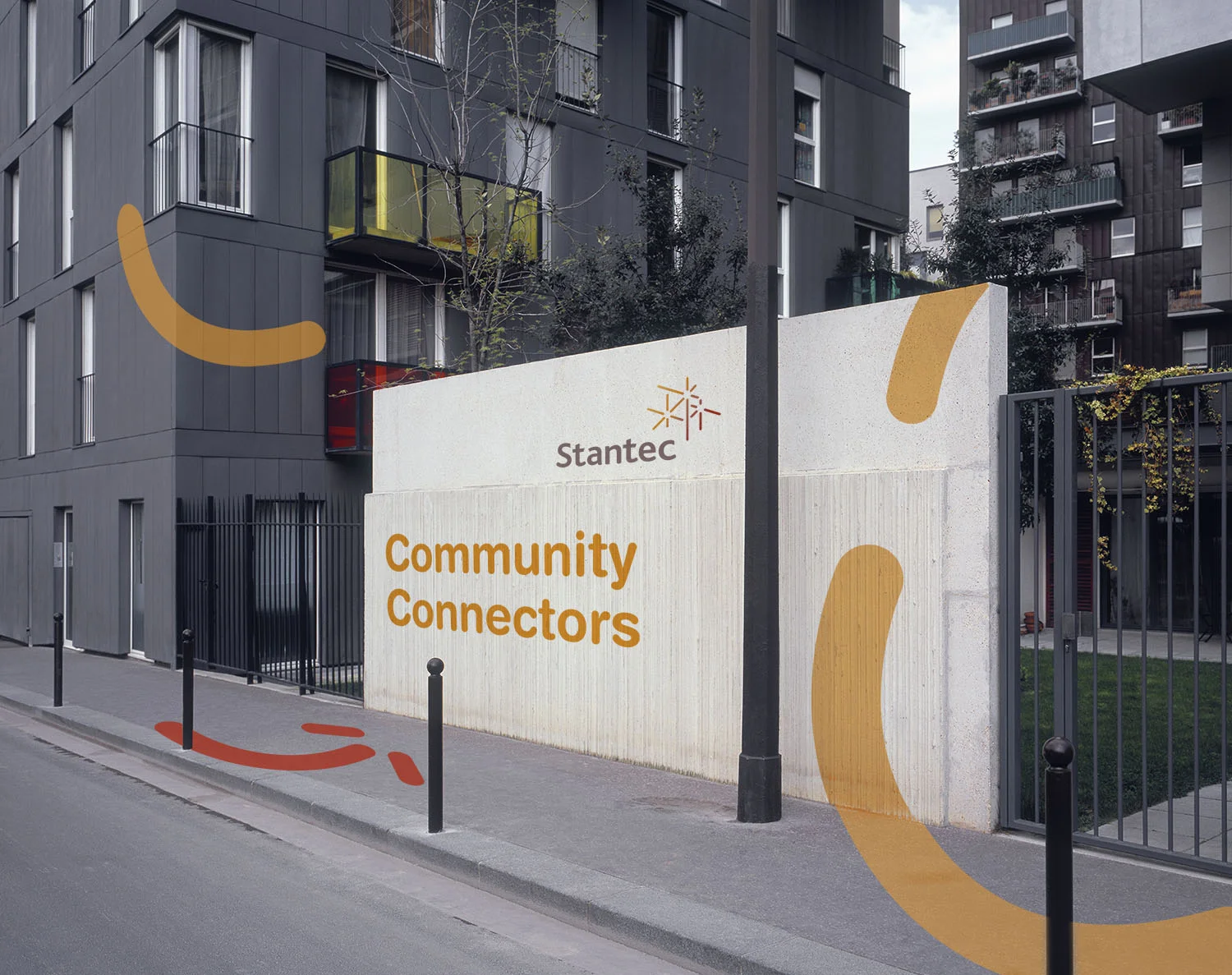
A refreshed logo and visual
system was envisioned
for Stantec—a professional
consultancy in planning,
engineering, architecture,
interior design, environmental
sciences, and project
economics. The logo is a
symbol of creative thinking,
reliable structure, and
dynamic connectivity—
complemented by a visual
language which embodies
the rigor and energy Stantec
brings to all their projects
and relationships.
A project with:
Siegel+Gale, New York
Trade Advertising
Brand Magazine
Digital Illustration
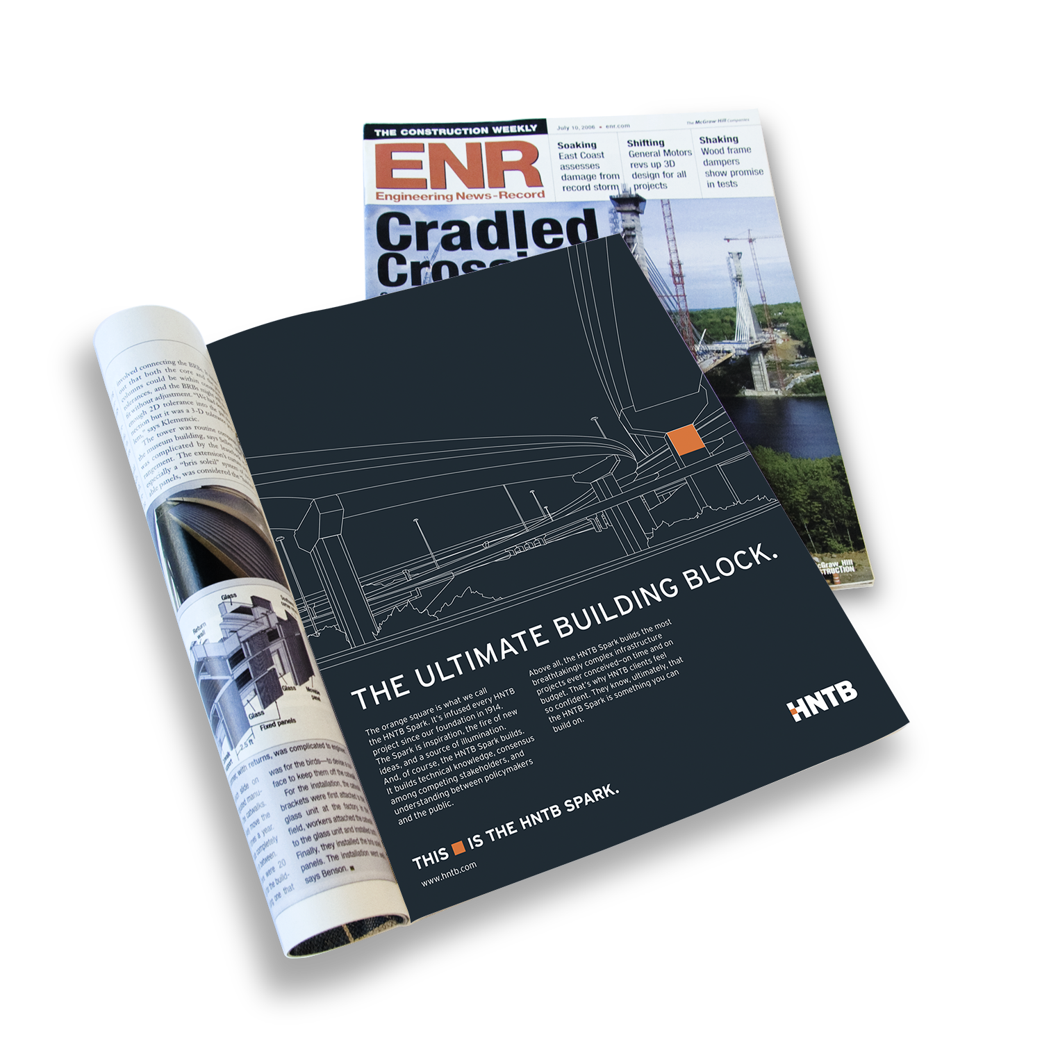
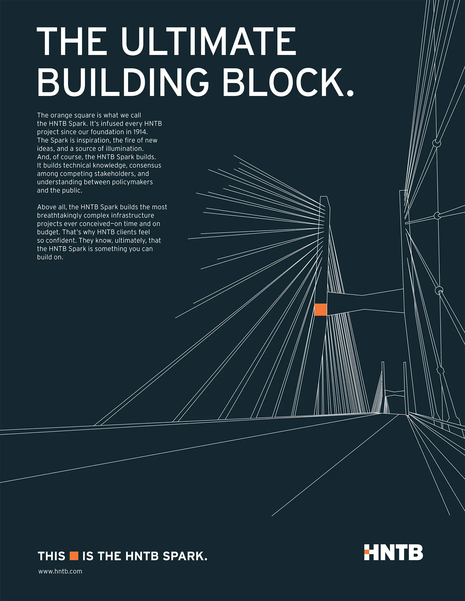
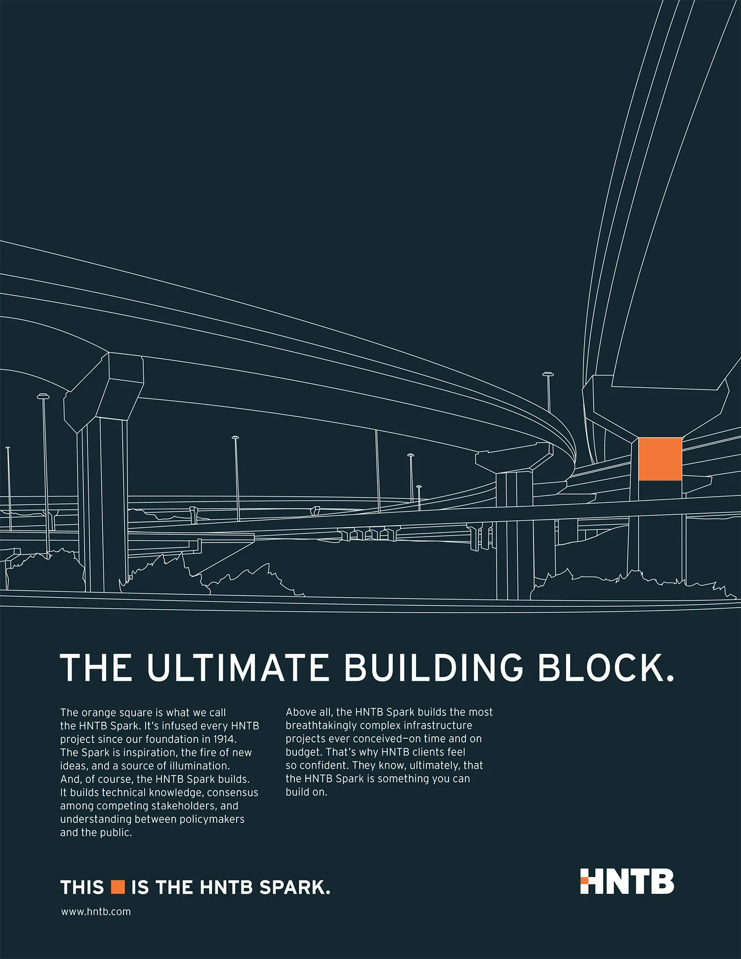
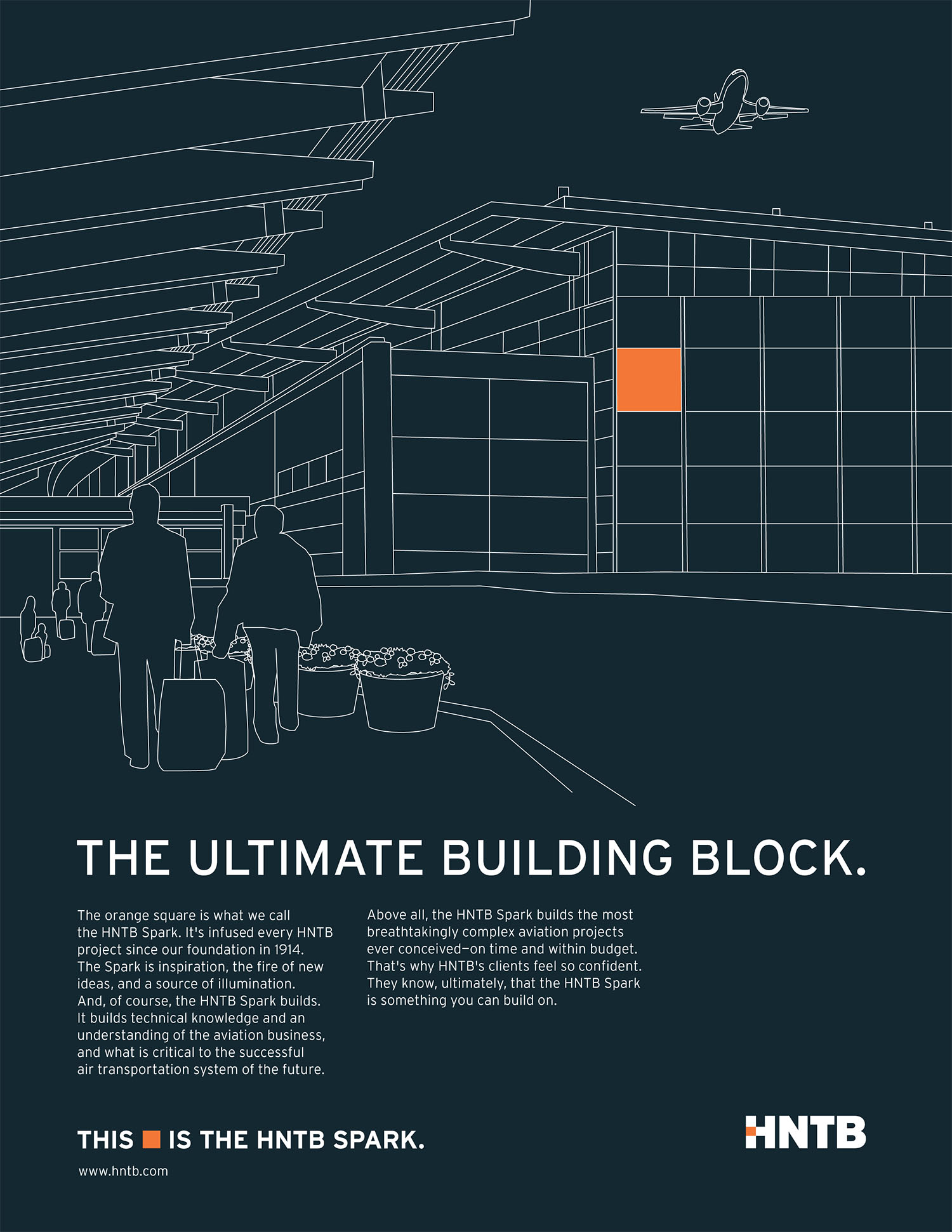
HNTB is a multidisciplinary firm
known and respected for their
work in transportation, bridges,
aviation, architecture, urban
design, and planning. The
“Ultimate Building Block” ads
feature original line drawings
of representative infrastructure
projects and include the most
recognizable element of
HNTB’s identity: the orange
square from the “H” in the logo.
The square, or ‘spark,’
represents HNTB’s creativity
and imagination, which are
applied to all projects.
HNTB’s advertising platform was
so successful, that the same
illustrative visual style was applied
to extend their brand further,
with applications such as their
brand magazine. The HNTB
spark continues to remain the
center of creative activity within
all brand applications.
A project with:
Siegel+Gale, New York
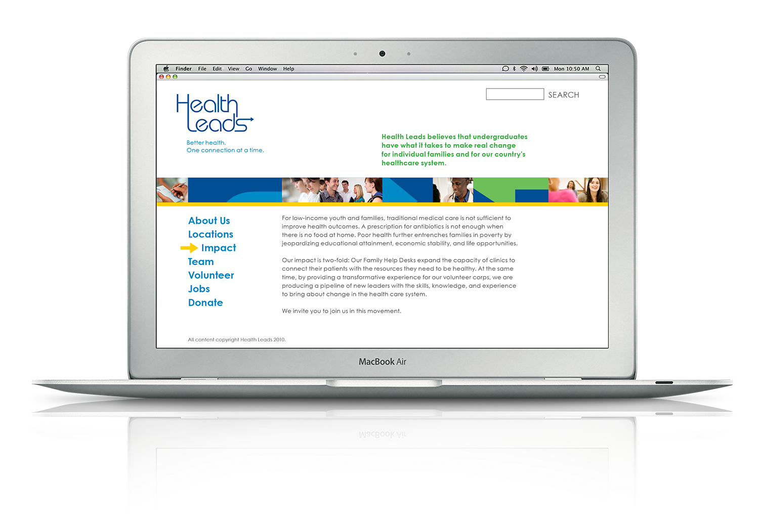
Identity
Visual System
Brand Guidelines
A visual identity was created to
directly reference Health Leads’
unique organizational model
of leveraging college students’
skills to overcome the critical
challenges low-income patients
simultaneously face—they have
little food, they are unemployed,
they struggle to keep up with
bills—all which affect their health.
The organization connects
patients with the basic resources
they need to get and stay healthy.
A project with:
DeSantis Breindel, New York
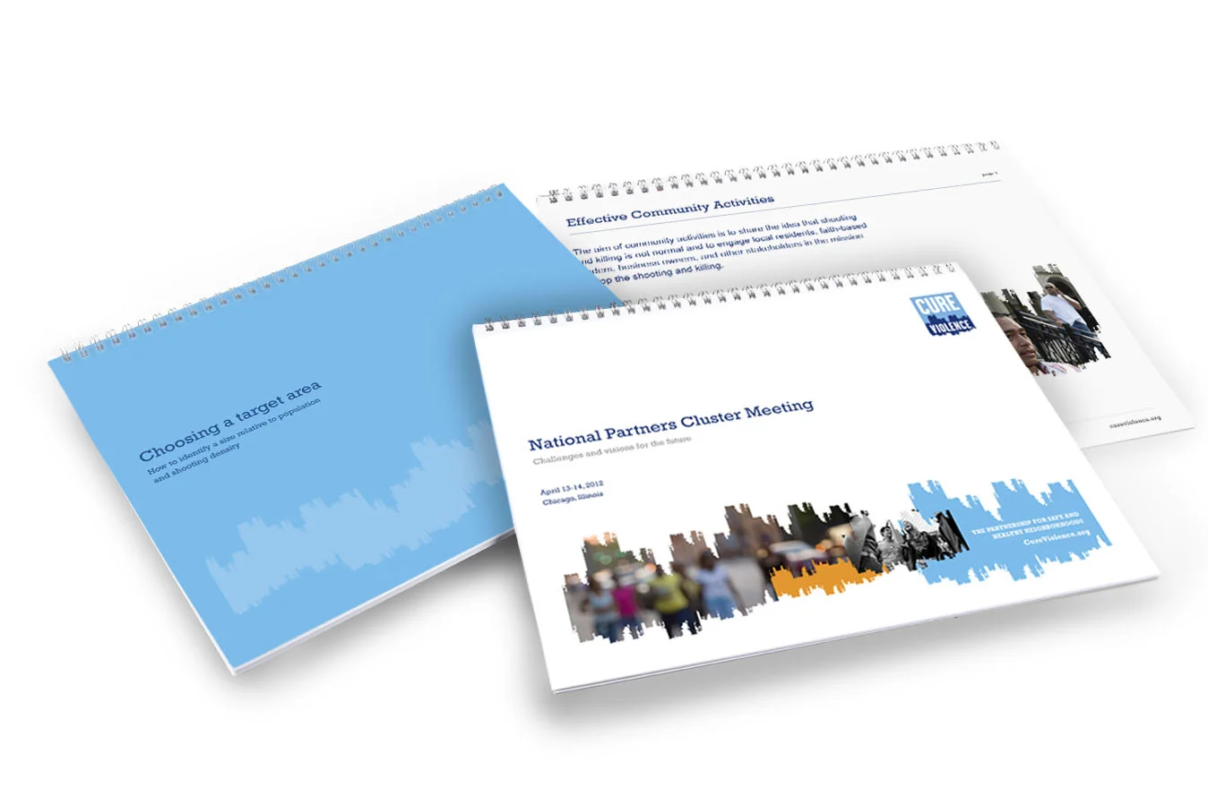
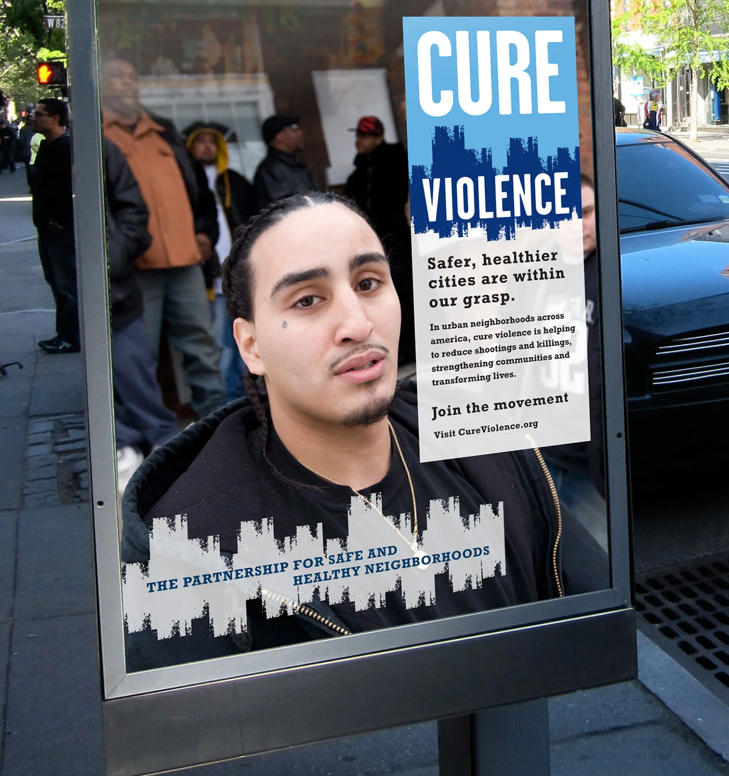
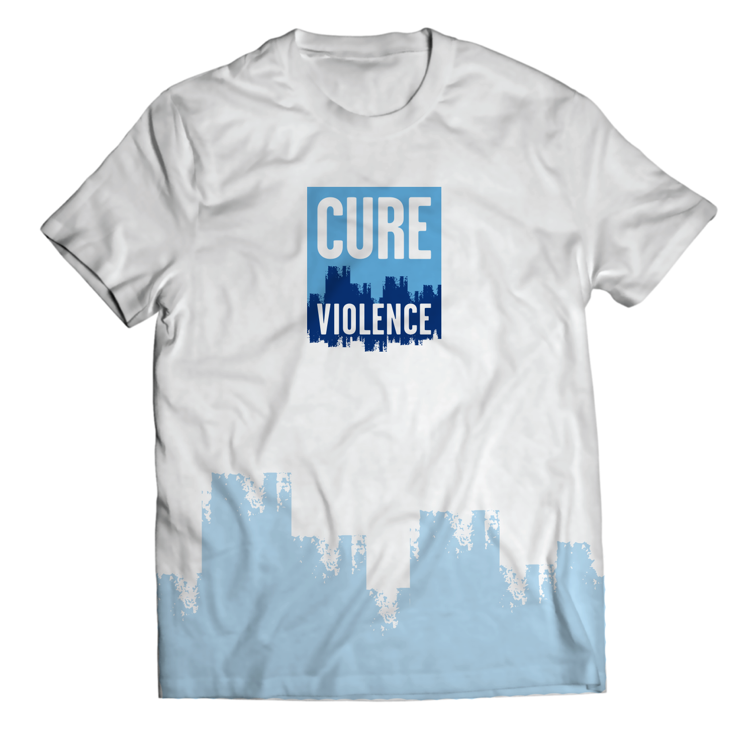
Identity
Visual System
Brand Guidelines
A non-profit organization based
in Chicago, the Cure Violence
model treats urban violence like
an infectious epidemic—utilizing
rehabilitated offenders to go
into gang-related neighborhoods
and homes to detect and interrupt
potential volatile events before
they spread. The identity
was created to reference both
the urban element (city skyline)
as well as the scientific aspect
(medical EKG readout), while
also focusing on the word ‘Cure.’
A project with:
DeSantis Breindel, New York
Identity
Visual System
Brand Guidelines
Rave Wireless builds, sells, and
supports applications for
mobile users that deliver two-way
safety solutions to colleges and
universities nationwide. The logo
solution represents the essence
of what Rave does: enabling
a dialogue between universities
and students. It always appears
black and white, allowing it
to cut through all the clutter of
the university environment.
The three talk bubbles symbolize
connecting, communities, and
the voice of all who use Rave.
A project with:
Siegel+Gale, New York
Branding Concepts
Identity
Visual Applications
To solve the problem of each
B.B. King live music venue
nationally having a different
look and feel, the goal was
to create a new, contemporary
identity to be embraced as
a master-brand for all the clubs.
This new proposed identity
encases the typographic elements
of the logo within a unique
holding shape, based on the neck
of B.B. King’s guitar, Lucille.
The expressive, custom
typeface was created to evoke
the intensity and emotional
power of the blues.
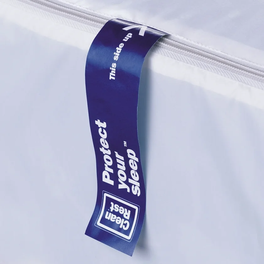
Identity
Packaging Concepts
Fabric Pattern Design
Website
Iconography
Tagline Development
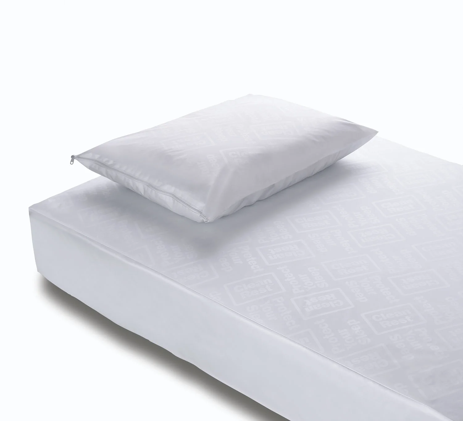
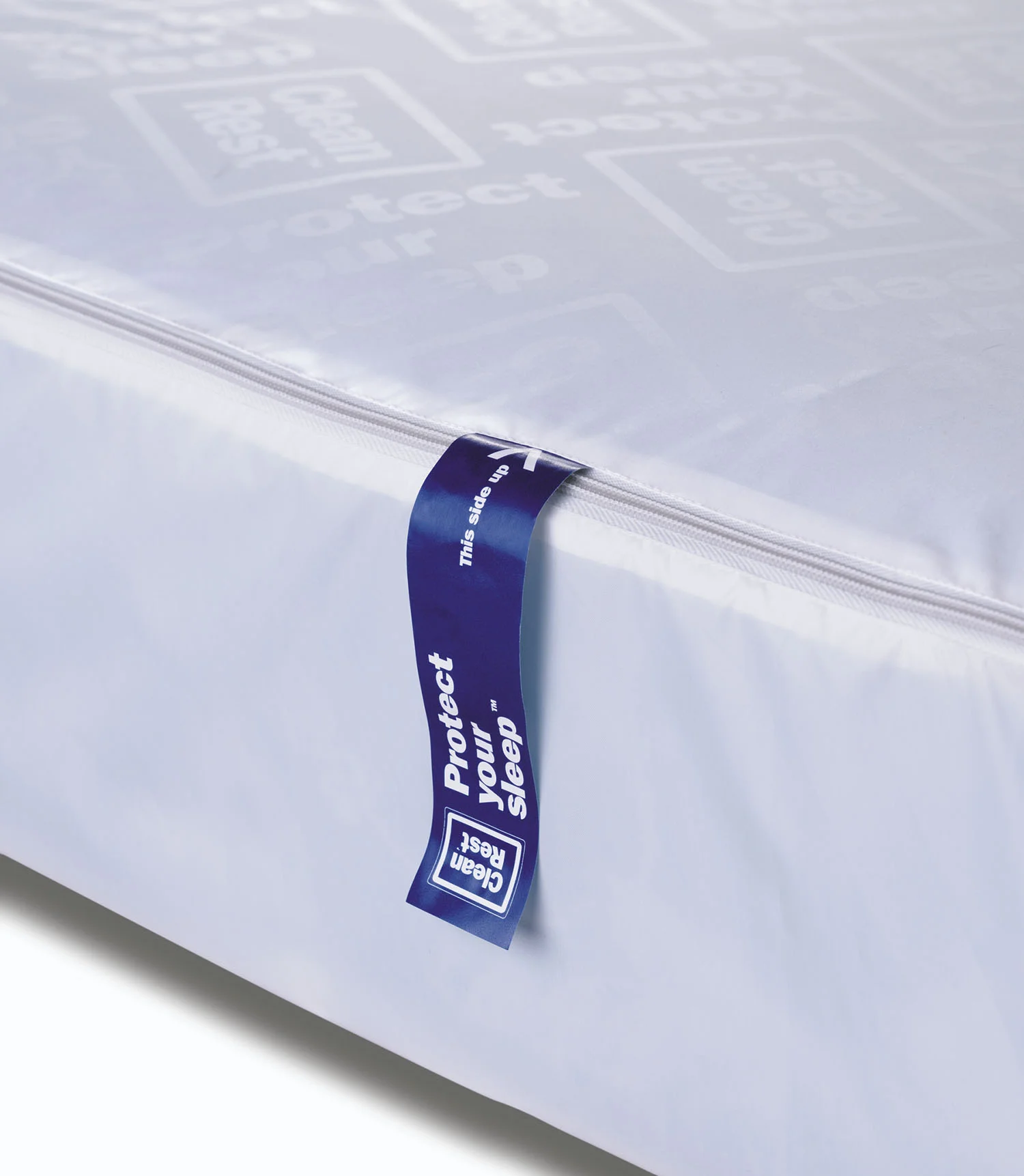
Using a bold but friendly
typographic solution,
the CleanRest name is turned
on its side and placed
within a graphic barrier to
represent two people sleeping
soundly in their protected
bed. A combination of a
proprietary color and graphic
icons were used instead of
photography, as the logo itself
becomes the front cover of
the package—instantly standing
out amidst a sea of sameness
in the allergen bedding aisle
of stores.
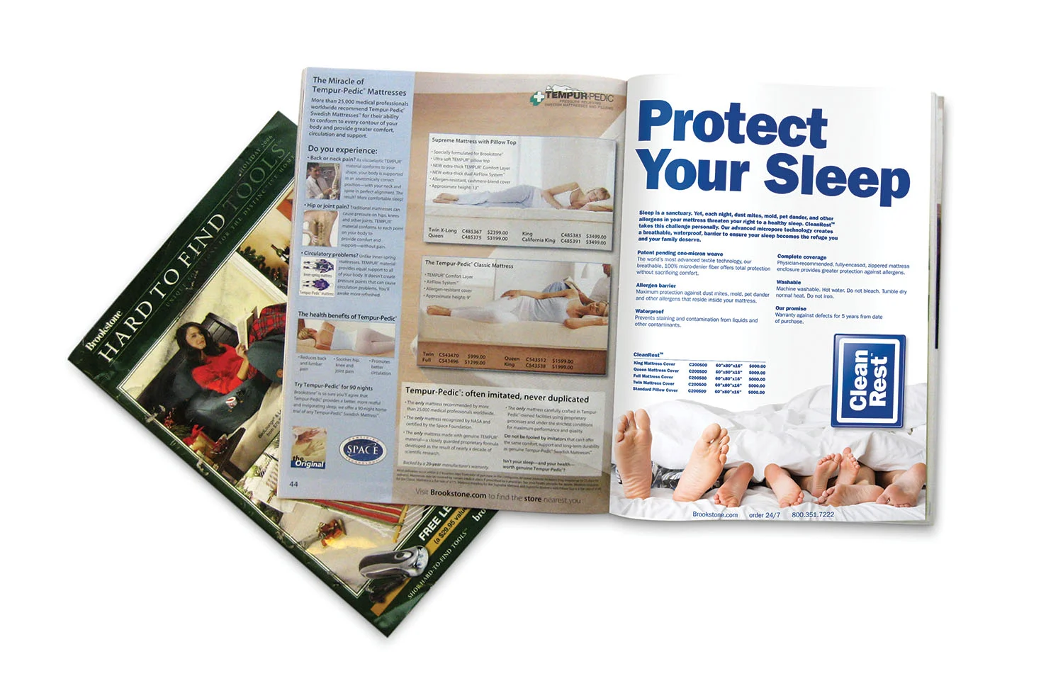
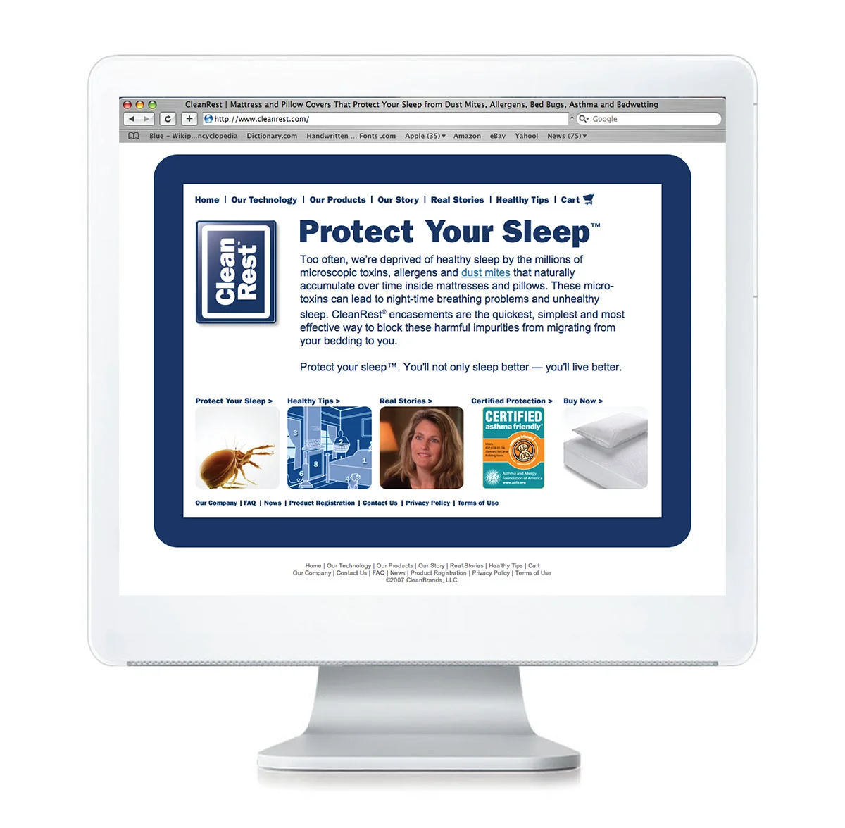
“Protect Your Sleep” was
developed as CleanRest’s
promise and call to action,
supported with advertising and
a comprehensive website.
The website is contained within
the protective barrier from
the CleanRest logo to reinforce
the brand story, while schematic
illustrations were created to
reveal the range of their products.
A project with:
Siegel+Gale, New York
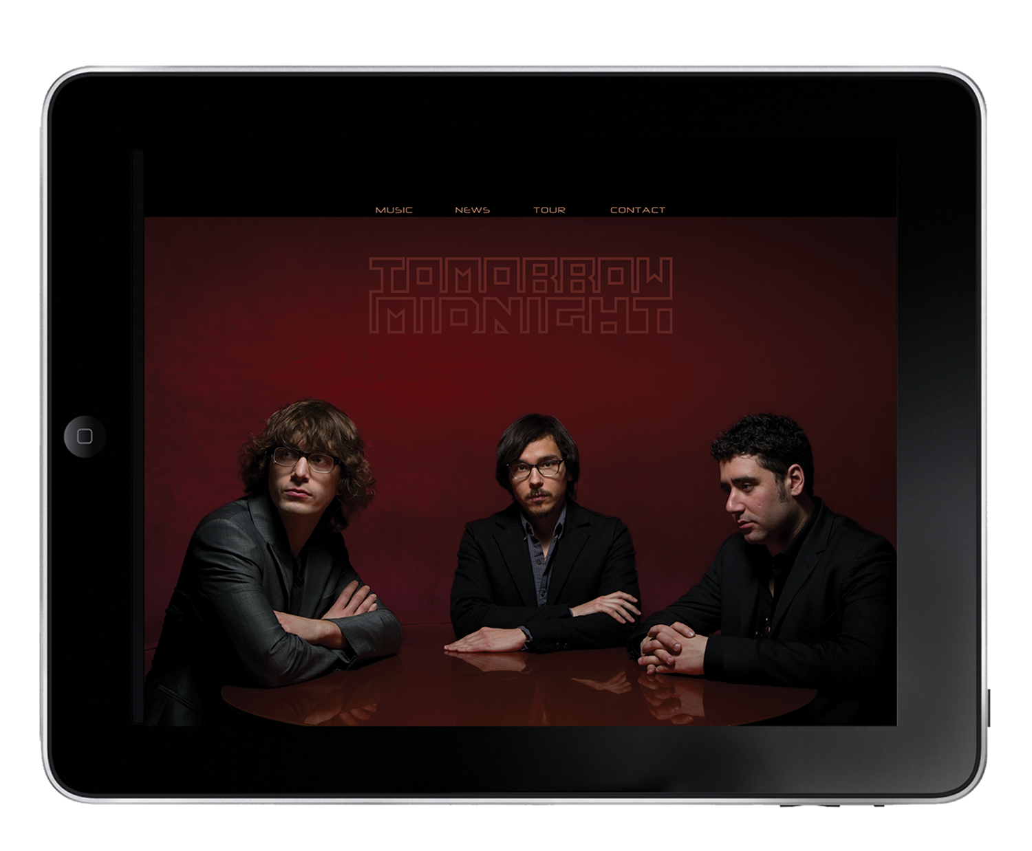
Identity
Art Direction
Promotion
The logo for this New York-based
band, whose sound and
visual aesthetic is reminiscent of
Joy Division and Interpol, was
designed to reflect a sense of
urgency present in their music’s
sensibilities—with the composition
of the letterforms referencing
a futuristic horizon. Art direction
of multiple photo shoots was
also aligned with the newly-formed
visual brand.
Identity
Stationery
Collateral
After shortening their name
to simply Milberg, a new brand
was developed which needed
to reflect a sense of renewal
and distinguish them as a
sophisticated, yet contemporary
law firm. The mark itself
represents their unique cache as
having a fully integrated team
of high-level specialists in various
fields. A proprietary green
and dynamic black-and-white
perspective photography, further
differentiated them from their
more traditional competitors.
A project with:
Suka Design, New York